Abstract
Join us on April 6 for a walk-through of how to take a sad plot and make it better by Alison Hill.
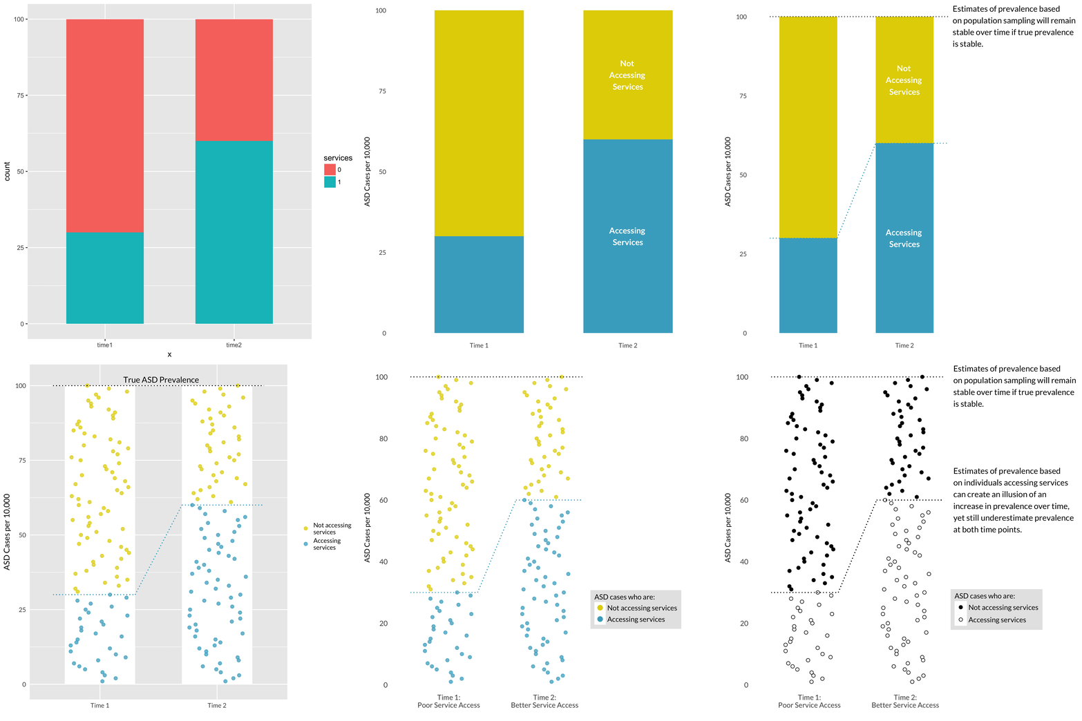
Join us on April 6 for a walk-through of how to take a sad plot and make it better by Alison Hill, who co-teaches the CS631 Data Visualization course. Alison will take us through one plot’s life cycle, from a sad Powerpoint slide to an Excel chart and finally to the finished product made with the ggplot2 package in R. We will discuss why each version of the plot fails in different ways, how each iteration improved on the last one, and which data visualization principles are at work in the final plot to communicate a clear scientific story.

Following this, Eric Earl (Senior RA in the DCAN Labs) will show a case study of visualization in neuroimaging research.
